


A few months ago, we published an article about how important it is to have a responsive website, i.e. one that is properly displayed on all screens, including smartphones.
So what exactly is a mobile-friendly site?
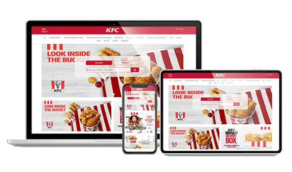
Your website can be considered mobile-friendly if it is displayed on a smartphone just as well as on a computer screen. You might not have considered this when you designed your website. And yet, it is vital: more than one person in two owns a smartphone. 58% of the population thus use a mobile device capable of connecting to the Internet. This figure reaches a staggering 90% among 18-24 year-olds!
So to reach out to as many potential customers as possible, offering a site tailored to these connection methods is essential. This is even more so given that French people (like everywhere else) don’t just use their smartphones to browse the Internet; they use them to consume.
Check whether your site is mobile-friendly in just a few clicks
To allow webmasters to check whether their websites are truly mobile-friendly, Google has developed a straightforward and highly effective tool: the mobile-friendly test, which analyzes a website’s URL and indicates – in just a few seconds – whether the page’s design is adapted to smartphone navigation. This Google bot thus checks whether your website is responsive, i.e. whether it:
- offers an optimal viewing and interaction experience, without having to zoom in or scroll to display text;
- avoids using software that is often poorly accommodated on mobile devices, such as Adobe Flash Player;
- integrates links that are sufficiently spaced out so that they can be easily clicked on a smartphone.
A site that fails to fulfil any these points will be very frustrating for the user, who is likely to steer well clear and not consider any form of interaction on it – booking, ordering, etc.
LivePepper offers a mobile-friendly solution
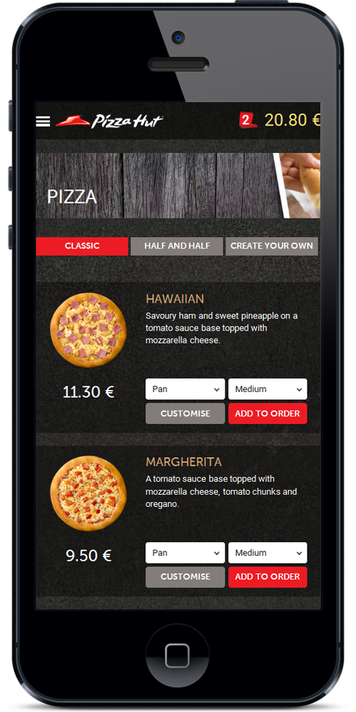
LivePepper, which specializes in online ordering sites for restaurants, offers a 100% mobile-friendly solution. We develop websites that are perfectly suited to all types of screens (computer, smartphone, tablet), no matter their positioning, their products, their target or their goals. Take the Google mobile-friendly test to see whether your site is mobile-friendly. If the result is red, by all means contact us: we can help you find a solution that is better suited to the needs and habits of your users. Contact LivePepper: asmolen@livepepper.com


